Arts week again – 7th-16th August 2026 – I will be showing some new work in acrylics and watercolour at The Concert Hall, Thomastown, Kilkenny. Themes are – Coumshingaun and Lough Derg on the Shannon, also some coastal and ‘lines of the land’ landscapes. Come along and say hello, I will have some unframed originals in my ‘haggle box’ and some new cards also.
Particularly, I would like your feedback – especially on which medium I should focus on for the coming year. Acrylic and watercolour share some characteristics but are in reality quite different. I have been painting seriously, for ten years, and hope to go on for many more – which direction though, there are so many options and so many things to try out.
Disappointments and elation are the lot of the artist – highs and lows. Selling a painting is a high – having and exhibition and selling nothing – a low. I had both of these in 2025. The new year brings internal debriefing, analysis and resolutions.
My resolutions are much the same – but they didnt work last year – why not? Lets see.
1 Do more networking.
I suppose I didn’t try hard enough. I have met lovely people, artists, over the years. I reckon I don’t do enough to follow up on these new friends. Artists are somewhat reclusive by nature, like to keep to themselves! I thought maybe I should offer something – so my response this year is to float the idea of doing workshops. So, my watercolour workshops, running in February and March are booked out.
Also, I want to organise some pop-up group exhibitions – I think this could be good.
2 Sell more art online.
Big misconception here, I thought at the beginning that this would be it. I did sell a few paintings through FB, and one or two from my website. I tried an on-line gallery – nothing. In pursuit of this goal – I spend too much time on FB and Instagram, made a disasterous foray into substack, and ran a mile from TIKTOK. All time wasters. My only response this year is to try an new online gallery – I am putting my art up on Irish ArtMart. I’ll put up at least one piece each week, and try to work the site as best I can. We’ll see how it goes.
3 Brick and mortar galleries
Exhibitions are the only thing that have consistently worked for me – so I’ll keep this up. I’ll have details of these on my website – under ‘about’, or I may open a new page for this, I think I will ). I have exhibited with some success in Kilkenny and Thomastown, Tramore, Portumna, Carrick-on-Suir and so on – all in the provinces.
As for galleries – I’m not really impressed, most had little interest in my work. I visited many of these in 2025 – comissions are high and the speel is not convincing. Still, I would like to find a gallery that I would be comfortable dealing with! There are not too many galleries interested in emerging artists, which is a pity.
For 2026 I want to show my work in the capital, either an exhibition or a gallery. I’ll just have to do the footwork and hawk my art around!
However, I am going to try to work with the ‘Hat’ – I think he might be able to help. You probably wont read this Tony, but I’ll be in touch with you soon.
4 Try new things – learn new techniques.
I had been painting exclusivley in watercolour for the past eight years or so, but in 2025 I ventured into acrylics for the first time. It worked well – I sold a few large pieces at good prices. Now I fear that I might become addicted to this new medium, I need to guard against that. Also I have always been a representative landscape painter, I have been thinking I should try a more abstract approach. Its hard to change! During the latter half of the year, I hope to register for some workshops – maybe portrait painting or maybe go back to oil painting. I hope to create a new studio space where I can be messy and work with smelly oils.
5 Change but dont change.
I’m not in this for the money. I do need to sell paintings – they accumulate very quickly and create a storage problem, I need to buy materials (I just spent nearly 300 euro on brushes), and sales are the ultimate vindication, the proof that your work has some merit.
However, I won’t paint what I think people want – I’ll continue to paint what inspires me, and hopefully it will be favourable received. I won’t get cought up in the nonsence of the Irish art scene – there is a huge amount of posing by people of dubious values, cronysm, unintelligible talk and an awful lot of people chasing public money – grants etc. Hmmm.
Ok so, I’ll try to stay true to my own values, promote my paintings as peaceful art for your home, with no hidden agendas or political statements. No nonsence. I just want to get my art out to more people.
So if you are an artist, maybe you know what Im talking about. If you’re a collecter judge my paintings for themselves, not by what I or anyone else says about them. If your not a collecter, per se, but like my work – get in touch. If you’re local pop around for a chat.
Anyway – here’s to 2026, may it be a good year for art. Regards, Micheal.
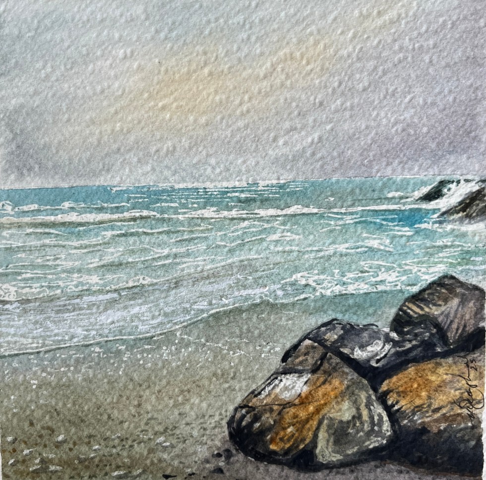
The image above will be on display at the Greenacres Gallery in Wexford during February 2026. (Seagulls at St Helen’s)
I just finishd the book on Monet’s life, that I was reading. Interesting fellow. I now have a better understanding of his art, and how he worked. There is a lot to take away, too much to talk about in one blog.
Monet regularily went out and about in the countryside, usually on his own, looking for images to paint. These wanderings might take some time, then ‘bingo’. Once he found the view he wanted, out came the easel and canvas, and so to work.
Me, myself and I, and usually herself, regularily go out and about. We both like a walk in the country (beach, cliff tops, woods etc), it’s good exercise, and I regularily have a ‘Monet moment’. This happens when I round a corner and there in front of me is a scene I would love to paint. It happens often enough. It is not feasable to bring my gear with me on these walks, so the camera on my phone is my way of recording the image. I therefore fully understand Monet’s obsession with finding the ‘right’ composition. I use the photo to record the detail, but I am fortunate to be able to hold the feeling in my mind for quite a long time. I dont need to return to the same spot, but I’ll paint the scene when I get back to my studio. I do believe though, that if Monet had a digital camera, he would have worked quite differently.
My most recent major ‘Monet moment’ occurred whilst driving between Kilamery and Kilmaganny, a winding road through the beautiful south Kilkenny countryside. I got a glimse of a field of blue flowers, and jammed on the brakes. Herself was a little alarmed. Reversing back I parked the car, I had to get into this field. It was late evening in September, the golden sun stretching accross the valley. The view was magnificent.
Fixing the feeling in my mind, and taking a good selection of reference photographs, including some of the little blue flower that sporadically covered the field, we headed off home. Thanks to Mr Google, I learned that the flower was Phacelia – used as a green manure. I hadn’t come accross it before. The field thus planted, was about forty acres, and it looked majestic. My rendering of it (A4 watercolour) is shown above. I think Monet guided me a little, in its execution.
Its a pity that Monet never came to Ireland. I would really love to see what he might have made of the Irish countryside. Still, if he did, we might not have the waterlillies.
I sold my sailboat (Lydia) early in the summer and bought a motor boat. I miss the sound of the halyards banging against the mast, tiller steering, ropes and wires everywhere, and the challange of trying to sail off a lee shore. Still the new boat has an oven, fridge and the crew is happy. Having a boat allows me to get to places where the landlubber can’t go. I love to paint the river and the lakes. Having a boat means you can paint the shore from the lake, rather than the lake from the shore. The painting above (called Coos Bay) records Lydia’s last voyage. There are a lot of memories in it, a lot of emotion.
I’m reading a book on Monet at the moment. It’s slow going, I read, view his work, google some aspect or other, and reflect. I’m finding that we have a lot in common. Monet too had a boat. Frustrated by painting the river from the bank, he wanted to paint the bank from the river. His many seascapes depict the Normandy coast and Brittany, but in adult life, he always lived on the bank on the Seine. Having set up his floating studio, he found he had to acquire another boat because the wife and kids just wanted to mess about on the water. So, he had a studio boat and a pleasure boat.
My new boat is nicely set up for drawing and painting. I fear, though, that I might have to follow Monet’s example and get another soley for plein air painting. Once the motor boat gets into a safe harbour, it tends to stay there, near all the shorebased distractions (like shops).
In relation to incidential trivia, did you know that when Monet was beginning to gain traction as an artist, the President of France was non other than a Patrick McMahon. Monet’s youngest son was born on St Patricks day, just like my youngest son. (Monet didn’t go for Pat but called him Mick instead).
A selection of my new acrylics that will be on exhibit at the Concert Hall, Thomastown during Arts Week / TCAF25, running from Sunday 10th to Sunday 17th August 2025. I hope to have some watercolours on display also. All new work. I can be contacted by txt on 087 6695635. To buy/reserve a painting – you can pay by Revolut. Prices will be available at the exhibition.
This is a little (A4) oil painting I did a few years ago, in a frame I made myself. I havn’t ever shown it. Shortly afteerwards I started painting in watercolour and worked exclusively in that medium for many years. I might bring it to the Mountshannon Arts Festival on the June Bank Holiday weekend 2025. I will be exhibiting some of my paintings (watercolours and acrylic) in the Berry Tree Cafe, at least thats the plan so far. Yes, I hope to sail there myself and I’ll be there for the weekend to enjoy the festivities and chat about my work. I love Lough Derg.
I’m doing a bit of reading, these evenings, trying to plug some of the gaps in my knowledge of art. My particular interest at the moment is Impressionism. This quote sticks in my mind – ‘every landscape painter inevitably becomes a painter of light’ (i). I don’t think I had fully realised this, until I read it.
For my own part, my own special interest is in painting water. Now I see, it is not the water that intrigues me, but the light on the water! Water reflects light better than anything else. Why did I not realise that I was a painter of ‘light’ all the time?
Now that I understand this, I am even more enthusiastic about painting the landscape. I just thought I’d share this.
The painting above is 60x60cm, part of my Canary Island series.
I mentioned in a recent post that I was experimenting with acrylics, especially for bigger paintings. Here is one just finished (the stove is not lighting, its just so that you can get an idea of the size). It is Tramore of course, but has no title just yet. I want to thank Brendan StJohns Photography for posting up some lovely photos and for his permission to use some as references. I have lots of photos (and paintings) of Tramore, but dawn always presents a challenge (as in its usualy early in the day!).
As the year draws to a close, I want to thank everyone who supported my endevours by buying my paintings. I had exhibitions in Tramore, Portumna and Thomastown, and here in Stoneyford. It was my best year yet. Lots of plans for next year – watch out for my exhibition in the Watergate in Kilkenny in Feb/March, which will be all watercolours, and come and see me in Thomastown during Arts Week. I will be including acrylics, for the first time, in my exhibition during Arts week.
For now, I have tidied up my studio, and put everything away, until the new year. I am hoping for a quiet and a happy Christmas, with my family and I wish you all the same.
Winter Studio Sale …… I have too many paintings in stock at the moment, its as simple as that. I am selling many of them at half the exhibition price (to personal callers only). Do pop around if you’re in the area, but maybe ring first – to be sure I’m at home. Stoneyford, Co Kilkenny.